This page is to provide helpful tips and to aid you in developing a proper print file. The biggest problems we find that customers have while doing their layout can be divided in four major categories. They are Images, Fonts, Bleeds and Live or “Safe” Area.
Color Basics
To understand how colors relate to printing you need to know the difference between projected and reflective color.
Projected Color
Scanners and digital cameras create images using combinations of three colors: Red, Green and Blue (called “RGB”). These are the colors that computers or TVs use to display images on your screen. This is color produced by light shining out or projected color. The problem is there is no way to do “real ink on paper” printing from a file that has colors created in RGB. They must be converted to CMYK. You can convert your RGB images using an image-editing program like PhotoShop or Corel PhotoPaint.
Reflective Color
When an image is printed on paper a color is produced by light hitting the paper and reflecting that color (spectrum).
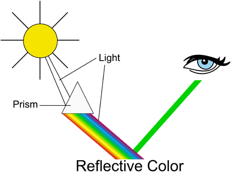
In the printing industry to produce all the colors in the rainbow four colors are used: Cyan (blue), Magenta (red), Yellow and Black (K) (called “CMYK”). You must start with a CMYK image or convert your RGB image to CMYK in order to produce a printed product. You can convert your RGB images using an image-editing program like PhotoShop or Corel PhotoPaint.
RGB to CMYK Color Conversion
Files that have been created in RGB will need to be converted to CMYK because it is not possible to do real ink on paper printing from an RGB image. Files that were created in RGB and converted to CMYK will have a color shift. On some designs it is not very noticeable on others the shift will stand out. During a color conversion all colors go from being built from 3 colors to being built from 4 colors. The colors are also changed from projected light to reflective light. Notice on the RGB color chart above that when all 3 colors come together the color white is produced. When all colors come together on the CMYK color chart the color black is produced. We prefer that our customers convert their RGB images to CMYK, therefore they have control over the final outcome. We will convert files for a nominal charge.
Black Builds
Use caution when you have a solid area that is Black. Four-color process (CMYK) should be used to create a deep, dark, black, however if the total percentage of all four colors is greater than 340% your document will not print properly. Ink will saturate the stock and you will not be pleased with the final product. The only exception to this rule is text, please see the Black Text / Font section. We have developed settings that we know work well on our presses. Please use these settings when designing your document.
The optimum settings for Black are:
100% Black
75% Cyan
70% Magenta
40% Yellow
If your black builds exceed 340% we will correct it for you for an additional fee of $10.00.
BLACK TEXT / FONTS:
When creating black type please give it the following CMYK break down;
100% Black
0% Cyan
0% Magenta
0% Yellow
Resolution
All images used for printing should be a minimum of 300 DPI at the size used for layout.
PPI vs DPI
The first important point to understand about resolution is the difference between PPI (pixels per inch) and DPI (dots per inch). Many software programs and scanner interfaces use these two terms interchangeably but that’s not exactly accurate. As a general rule, the term PPI should be used when referring to image resolution, and the term DPI should be used when referring to printing resolution. How can you remember this? Monitors display pixels, and printers produce dots.
Printed images are composed of dots. Image resolution is simply the number of dot in a 1-inch grid.
There are two aspects to every image:
The image’s dimension (width and height in inches) and its resolution (the number of dots per inch). These two factors alone determine the total number of dots in an image. For example, a 2-inch by 3-inch image with a resolution of 300 dots per inch contains (2 x 300) x (3 x 300) or 540,000 dots.
The DPI of an image is determined when the image is captured. Let’s say you scan an image at 200 DPI into PhotoShop. Once in PhotoShop you increase it to 300 DPI. The image will print as if it were a 200 DPI image. All you have done is used 300 dots per inch to produce a 200 dots per inch image. You will need to recapture your image at 300 DPI or scale it accordingly.
Format
Scanned images should be saved in a TIFF (.tif) or EPS (.eps) format to ensure the best color and sharpness possible. File formats such as GIF or JPG compress the picture and can cause it to look blurry and off-color when printed.
Scanning
When scanning images to be printed you should follow a few simple rules. Scan your image at the final size you will need for your page layout. Scan your image at a minimum of 300 DPI, 400 DPI if your image has text.
Digital Cameras
Images from digital cameras are acceptable, as long as the pixel resolution is adequate. For example, if your camera has a typical image of 1280 x 960 pixels at 72 DPI, you get about 17” x 13” of photograph at 72 DPI. This is comparable to a 4” x 3” –300 DPI image. 4” x 3” would be the maximum size that the image could appear in your printing layout.
Calculate the resolution of your digital image and the maximum size you can go to retain a 300 DPI resolution as follows:
1. Determine the pixel dimensions from your digital camera
2. Divide those numbers by 300 (divide by 400 if the image contains text).
For example, an image without any text has a pixel dimension of 900 x 1200. When divided by 300, the maximum size of the image in your layout comes out to 3” x 4.” If you make the image any larger, it will not look sharp.
Web Images
You may be tempted to use a photo that you have lifted off of a favorite web site in your printing layout. Website images have a low resolution (72 DPI) and look terrible when printed on an offset press. Also, web images are in GIF or JPG format, so these images are sure to look disappointing in your final product. Check to make sure all images are at least 300 DPI and are legally available for use.
Proofing / Color Viewing
What you see is NOT what you get! Computer monitors display in RGB (Red, Green, Blue), while printed materials use process colors – CMYK (Cyan, Magenta, Yellow, Black). This means that your final printed product will look sharp and crisp, but the colors will look slightly DIFFERENT from those you see on your monitor. It is important to convert all your images to CMYK prior to submission. Select your specific software under “Mac Files” or “PC Files” in the Preparing your Files menu for more information about converting to CMYK.
Fonts
Use Font Families – Not the Style Bar – to Enhance your Type
To avoid having your type “reflow” during processing, it is very important that you do not add any style (bold, italic) to the fonts from the “type styles” option in either Mac or Windows. Use fonts from the original font family (i.e. Helvetica Bold or Helvetica Italic)
Screen Font Substitution
Screen font substitution occurs when a font such as “Venice” is available on the printer, but is not installed on your computer. Windows will allow you to choose this font, but will display another font, such as “Times”, on the computer screen. The printer device will still print the correct font. The result is a discrepency between what you see on the screen and what is printed. You can often tell which fonts are installed on your computer by opening the Fonts control panel and viewing the list of fonts. Most Windows programs will also display a “TT” icon next to installed fonts, and a printer icon next to fonts installed on the printer device but not installed on your computer.
To avoid screen font substitution issues use only fonts available on your computer. While not always possible, this solution works best. If you choose fonts that are not installed on your computer, the printed version of these fonts may look different than what you see on screen.
Printer Font Substitution
Printer font substitution occurs when you specify a font that is not installed on your computer, or on your printer device. This can happen if you switch printer drivers after composing a document for the first printer. For instance, if the “Venice” font is installed on the first printer, but not on your computer, the first printer could still print out the correct font. If you then switch printer drivers to a one that does not have “Venice” installed, the second printer will substitute another font in place of the missing font. In this case, Windows will substitute a font on your screen and when printing. If you are lucky, the same font will be substituted in both cases, but there is no guarantee that this will be the case.
To avoid printer font substitution issues, choose our printer driver as your printer driver when you first create the document. This will prevent changes from occurring when you switch from your local printer device to our printer driver. While this solution works for new documents, it does not work if you have already built the document using another printer driver. If you switch printer drivers after building your document, please make sure your font choices are still valid for the new printer device.
Word Wrapping
Word wrapping occurs when the flow of text changes when you switch printer drivers. This change could be as small as a single word at the end of one line wrapping to the beginning of the next line, or as large as reflowing your entire document. When you switch printer drivers, the document is automatically reformatted to meet the requirements of the new printer. Several factors can cause word wrapping changes, including different margin requirements, font substitution, and printer resolution.
Bleeds
If your document contains images or colors that extend to the edge of the page, it is considered a document with bleeds.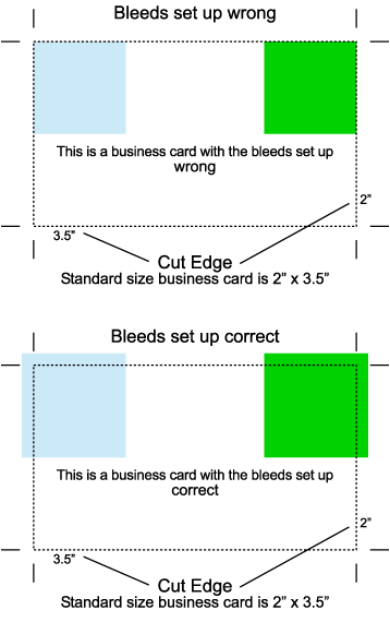
To understand bleeds you need to know a little about the printing process. When paper moves through a press it shifts a little from side to side. The movement is very slight and in most cases not noticeable. It does start to become apparent when you are printing a document that has a design element that prints all the way up to the edge of the document.
Lets use a 2” x 3.5” business card with a blue background for an example. If you are printing your card at 2” x 3.5” and the paper shifts 1/64” of an inch to the right during printing, then you will have 1/64” of white on the left. If you card moves 1/64” to the bottom you will have 1/64” of white on the top.
Over the years the printing industry has a trick to compensate for the movement of the paper. The trick is to extend your background color past the cut edge of your document. When this is done you have enough color so the white is cut off. This extra color that extends past the cut edge of your document is what is known as a bleed in the printing industry.
Example- Lets say you are printing the same 2” x 3.5” business cards with a blue background, however this time your card is set up at the size of 2.25” x 3.75”. You have extended your blue color .125” past the edge of your business card. Now when your card shifts 1/64” to the left there is enough bleed on the right to cover the shift. If your cards shifts 1/64” to the bottom then there is enough color to cover the top. Once the printing is done, we cut your 2.25” x 3.75” business cards down to 2” x 3.5”. The end result is you have a stack of 2” x 3.5” business cards and no white spaces around the outside.
Printing Help Desk asks that customers provide a 1/8” or .125” bleed on documents that bleed. This .125” bleed will make your file size .25” larger than the final size of your document. Lets say you are printing an 8.5” x 11” Product Sheet that bleeds. If you add .125” bleed to the left and .125” bleed to the right and then do the same top and bottom, the end result is document that is 8.75” x 11.25”.
Safe Area
Please read the above section about bleeds first.
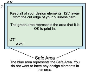
To understand a Safe Area you need to know a little about the printing process. When paper moves through a press it shifts a little from side to side. The movement is very slight and in most cases not noticeable. It does start to become apparent when you have a design element that is too close to the cut edge of your document. You also run the risk of part of your design element being cut if it is to close to the edge.
To help hide the fact that the paper has shifted and to keep your design elements from getting cut we ask that you keep all of your elements, that do not bleed, a pre-determined distance away from the cut edge. The pre-determined distance is what we call a safe area.
Printing Help Desk asks that customers provide a safe area of .125” on all products.
Example– If you are printing a 2” x 3.5” business card that does not bleed, you should contain your design elements to 1.75” x 3.25”. This will leave a blank space of .125” on all sides of your business card. This will help hide the fact that the paper shifted and will keep parts of your design from being cut off.
Critical Folds
To understand Critical Folds you need to know a little about the printing process. When paper moves through a press it shifts a little from side to side. The movement is very slight and in most cases not noticeable. It does start to become apparent when you have a design element that is too close to a fold.
To help hide the fact that the paper has shifted we ask that you keep all of your elements a pre-determined distance away from the fold. The pre-determined distance is what we call a gutter.
Printing Help Desk asks that customers provide a gutter of .125”. The .125” gutter needs to be on both sides of the fold. It is OK to extend a background image or color across a fold as long as the background image does not start or stop within .125” of the fold.
If you have a document to print that has design elements that start and stop on a fold OR are closer than .125” to a fold then it is considered a document with Critical Folds. We will make every effort to maintain your folds as you have requested, however we do not guarantee critical folds.
Booklets and Crossover Images
To understand Crossover Images you need to know a little about the printing process and how booklets are made. We are going to use a 12 page, 8.5” x 5.5” finished size booklet as an example.
When paper moves through a press it shifts a little from side to side. The movement is very slight and in most cases not noticeable. It does start to become apparent when you have a design element that is too close to a fold.
If you are printing a booklet there are two sizes you need to be aware of, the flat size and the finished size of the booklet. Printers create an 8.5” x 5.5” booklet (finished size) by printing 8.5” x 11” sheets (flat size).
We are going to number the pages on our booklet as follows; the front cover is page 1, first inside left page is page two; the first inside right page is page three. This continues through the book until your reach the back cover, which is page 12.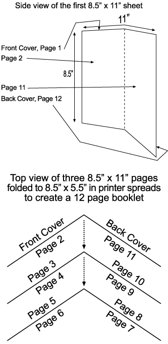
One 8.5” x 11” sheet printed on both sides created four 5.5” x 8.5” pages. Two 8.5” x 11” sheets creates 8 pages. Three 8.5” x 11” sheet create 12 pages.
On the first side of first 8.5” x 11” sheet, the front cover, page one, will take up the right 8.5” x 5.5”. The back cover, page 12, will take up the left 8.5” x 5.5” half of the sheet. Note – page 1 and 12 are on the same 8.5 x 11 sheet. On the second side of the first 8.5″ x 11″ sheet the left side will be page 2 and the right side will be page 11.
The second 8.5” x 11” sheet will have page 3 and 10 on one side. Pages 4 and 9 will be on the other. The third 8.5” x 11” sheet will have page 5 and 8 will be on one side. Pages 6 and 7, the centerfold, will be on the other. This is what is known as printer spreads.
Each of the three 8.5” x 11” sheets will be folded to 8.5” x 5.5”. Then they will be collated and stitched to make a 12-page booklet.
Now, lets say when you open the cover of your booklet and are looking at pages 2 and 3 you want your customer to see a motor cycle rider taking up both pages. To accomplish this you will need to print the left half, page 2, of the motorcycle rider on the first 8.5” x 11” sheet. You then will need to print the right side of the motorcycle rider, page 3, on the second 8.5” x 11” sheet. So, one image, the motorcycle rider, is being printed on two separate pieces of paper. Those two pieces of paper are then folded and stitched together to make one big image. This is what is known as a Crossover Image. We will make every effort to maintain your Crossover Images as you have requested, however we do not guarantee them.
