How To Set Up Files For Printing
One of the most important assets you can have as a designer doing print work, whether you are new or old is an understanding of how to correctly set your files up for printing. There are multiple ways to do this and I am not saying that my is the only way but, mine works and this will teach you fundamentals of how to correctly set up your file so your printer does not send them back to you and waste time in the printing process. There is however, some technical jargon in this article. I have included a glossary at the end that tells you what “the jargon” means. So veterans, students and anyone in-between will be able to read and take something away from this article.
Correct Colorspace
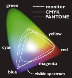
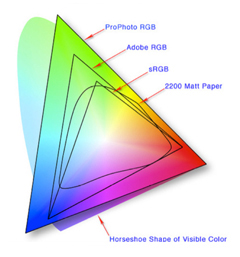
The most important thing is understand the difference between CMYK & RGB. Now, first off CMYK stands for Cyan, Magenta, Yellow and Black. RGB is Red, Green, Blue. Setting up the correct color mode is crucial for have the correct colors print and it being able to be used on a 4 color run. I usually send proofs to clients in RGB files. The reasoning is that it saves file space so its emailable or small enough file size I don’t bring their computer to its knees when I send it.
Why does it matter?
Let’s say your color is Cyan: C: 100 M: 0 Y: 0 K: 0 that means that the selected area is going to receive all the cyan ink on one pass and the next three passes will not lay down any ink on the spot. Making sure that you understand how your file will be printed and therefore how you need to save it is a step that needs to be taken so you can achieve accurate color in your prints.
Process Black vs. Build Black
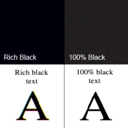
When printing you want to make sure that you specify that all your blacks are 100%. What I mean by this is in the CMYK colors it should read: C: 0 M: 0 Y: 0 K: 100% Doing this means that your blacks will print correctly as black and not a build of black and running the risk of printing as a dark grey that looks great on screen but no on paper..
Spot Colors

Most company logos have an assigned PANTONE color to them. This can add more colors to your print job. 4 color process is very common for print color specs. If you are adding a spot color that would be 5 colors. Most of the printers in my area can only support a total of 7. 4 color process + 3 spots. Logo’s are usually assigned a spot color and if the company has its own PANTONE color created just for them you will have to use their spot color. However other clients might not want the added cost of printing their logo in a spot color so you will need to print the logo in process color instead of a PANTONE. A PANTONE color has a CMYK value.
Example: PANTONE 032 (which is Red) has a CMYK conversion of: C: 0 M: 90 Y: 86 K: 0
The reason you would print the logo in a CMYK color instead of a Spot is to save money or you are already printing a spot color and the printer cannot accommodate another spot color.
The Color White
White does not print. When i first started designing I thought there was a white ink and I could make a white box on a page and get it to show-up on the design. A simple example of this is a newspaper. If you are designing something for a newspaper that is white that section will be the newspaper itself. The color will print around that white area.
File Format
Another way to get your files sent back to you faster than you can say Farfegnugen is to not save them in the correct format. Now, this does not mean save them “How you think is correct”, this means how the printer wants them. If they want a flattened Tiff, then you give them a flattened tiff. If they want a PDF X1A , then you give them a PDFX1A. Make sure that you know what you are sending them. If you have any questions send them an email or call them.
Remember: Not all printers want the same files.
This is especially true with newspapers a good portion of them, especially local use older technologies that we as an industry use. The 5 minute phone call will be easier than having to redo something later or having to reprint because you saved a file incorrectly. The last thing you want is to go back and work on a project you already thought was done.
Note: If you are in a crunch and don’t have the luxury of contacting the printer (time, phones are out etc.) Send all the formats you can think of to cover your basis. Usually a PDF (optimized for print not a low-res space saver) a Tiff an EPS, Packaged In-Design file or Quark file will usually do the trick.
Follow Directions
This ties in closely with the last point. Following directions will save you time and overall money, especially if something has to be re-printed because you carelessly rushed through the directions on how you were supposed to provide the file. The most important thing is that you take your time and double check that everything is saved & packaged correctly.
Image Resolution
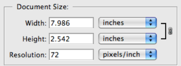
Making sure your files or images are in the correct Image Resolution (referred to sometimes as DPI or PPI) is crucial for non-pixelated images, great looking ads and just general quality. A rule for print is an image resolution of 300. Now, that being said I have designed things at 600 and 1200. Am I crazy or am I just trying to get high quality images? The point of designing with that high of an image resolution is because I was designing something half size that will be scaled up.
For example: I am designing a poster that is 40×80 @ 300. Now, the layered file for that sucker would be massive and would be cumbersome to make changes (just because it takes so long to save and open regardless of your machine’s performance capabilities) and much less what it would take you to upload this to our FTP site. So, you would design it at 20×40 @600 which is half size. This would be scaled up at the printer to the original size and therefore save file space and time.
Bleed, Trim & Live Area

If you haven’t designed for print before these may seem a bit foreign. The bleed area is what bleeds off the page. You have a bleed so your artwork gets cutout without an ugly white border around the outside. The reason you could get the ugly white border is because the images
Deadline
Another great way to save money and an angry client is making sure you get the files on time. It would be horrible to already have a spot in a newspaper or a magazine and miss the deadline. Now, if its a one off job there might not be a deadline set by the printer because its printed when you package your files and send them over.
Package Your File

Packaging your files correctly is one of the easiest ways to make sure your printer gets exactly what they need and not have any missing links. Packaging a file correctly in InDesign is a breeze you just click package. What InDesign does is find your images, your fonts and put them into their respective folders. This way the printer has everything they need. **DO NOT** send just your InDesign file. We will not have any of your images or your fonts so the file would give them errors when they open it. If you don’t have InDesign and are using another layout program make sure that you send the fonts the text is using and the images they are linking to. If you made your poster in Photoshop save it as a 300 DPI Tiff and then Place it in InDesign. Most printers set documents up to print from In-Design or Quark. This gives them the ability to set printers marks, a Bleed or Trim and Live areas. We wanted to call special attention to fonts and colors because they are some problematic areas.
Fonts
Spending hours on beautifully kerned typography and having an awesome layout because of it can be crushed in a matter of seconds if you don’t send the fonts that are using. Now, if you have converted your type to outlines in Illustrator or turned them into vector objects its not necessary. Usually this has to deal with body copy or headlines. If you are working in Photoshop your are safe. You can just save as a flattened tiff and be on your way.
Proof
Always include a PDF or a jpg in my packaged file of what you are sending to print. The reason you do this is so the printer knows what its supposed to look like so when they open the file if it doesn’t look like that something is wrong. Its an extra step that has saved me some issues and headaches in the past. We may have a different version of your font, they may not have it installed at all or you may have packaged something incorrectly.
Explanation
Make sure that you give us detailed instructions if your print job is something outside of the ordinary. A rule of thumb is if you are using varnishes, spot colors or anything that is not a typical 4 color process you should call or visit to talk through it. A small consultation can work wonders on working through something. Try not to do a barrage of emails as things can be lost in translation, taken out of context or read incorrectly.
File Setup Glossary
Bleed- a term that refers to printing that goes beyond the edge of the sheet after trimming. The bleed is the part on the side of your document that gives the printer that small amount of space to move around paper and design inconsistencies.
Trim- the final size of a product after its unnecessary parts have been cut off or removed.
Live Area – is the area where your art and type should be safely tucked into so they are not trimmed or cut-off.
PDF X1A– Common file type for printing. The purpose of PDF/X is to facilitate graphics exchange, and it therefore has a series of printing related requirements, which do not apply to standard PDF files. For example, in PDF/X-1a all fonts need to be embedded and all images need to be CMYK or spot colors.
PDF- (Portable Document Format) is a file format created by Adobe Systems in 1993 for document exchange. PDF is used for representing two-dimensional documents in a manner independent of the application software, hardware, and operating system
TIFF- (Tagged Image File Format) is a high resolution loss-less file format that is ideal for saving images for print.
DPI- Dots per inch (DPI) is a measure of spatial printing or video dot density, in particular the number of individual dots that can be placed within the span of one linear inch (2.54 cm). The DPI value tends to correlate with image resolution, but is related only indirectly.
PPI- Pixels per inch or pixel density is a measurement of the resolution of devices in various contexts; typically computer displays, image scanners or digital camera image sensors.
Image Resolution-describes the detail an image holds. The term applies equally to digital images, film images, and other types of images. Higher resolution means more image detail.
EPS- Encapsulated PostScript is a DSC-conforming PostScript document with additional restrictions intended to make EPS files usable as a graphics file format. In other words, EPS files are more-or-less self-contained, reasonably predictable PostScript documents that describe an image or drawing, that can be placed within another PostScript document.
Process Color- referred to as process color or four color, is a subtractive color model, used in color printing, also used to describe the printing process itself. CMYK refers to the four inks used in most color printing: cyan, magenta, yellow, and key black.
PANTONE Color- The PANTONE MATCHING SYSTEM is the definitive international reference for selecting, specifying, matching and controlling ink colors.
Selected Resources
Prepress Tips for Graphic Designers
David Airey explains some invaluable pre-press tips for designers.
Ultimate Round Up of Print Design Tutorials
Smashing Magazine puts together a great list for designers to use when looking for How-To articles on print design.
8 Print Finishes to Spice up your designs
Brian Hoff talks about Print Finishes that you can add to your designs and goes more in-depth with varnishes and colors.
10 PrePress tips for Perfect Print Publishing
Smashing Magazine has a l post about working in RGB colorspace vs CMYK. Its an interesting read and explains some good facts about working in RGB instead of CMYK.
Reflecting on Strike Through Varnish
Nick DeTomaso from Jakprints talks about Varnishes and how to use them and set them up.
Designing for Print- Setting up Crops and Bleeds
Chris Spooner goes in depth about setting up cropmarks and bleeds.
